A layout is a grouping of components that are placed together to present a section of the information on your page. These sections act as building blocks when designing pages.
Our example layouts aim to give you an idea of how you can combine components to effectively to promote your message. Layouts help the viewer identify what pieces of content should be read together. A layout can contain a heading, body paragraphs or bullet points, an image or video, or a series of cards. A page's layouts are stacked downward in order of importance (informed by the hierarchy of GEM's components).
Layout regions
Layout regions determine the area where you can place and group layouts on a page. Widths are defined by the number of columns they span, which allows layouts to adapt to various screen sizes.
We have two main page templates and each has various layout regions.
Three-column pages
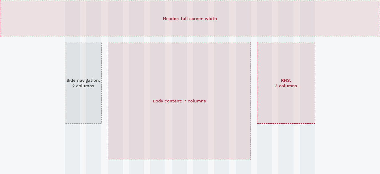
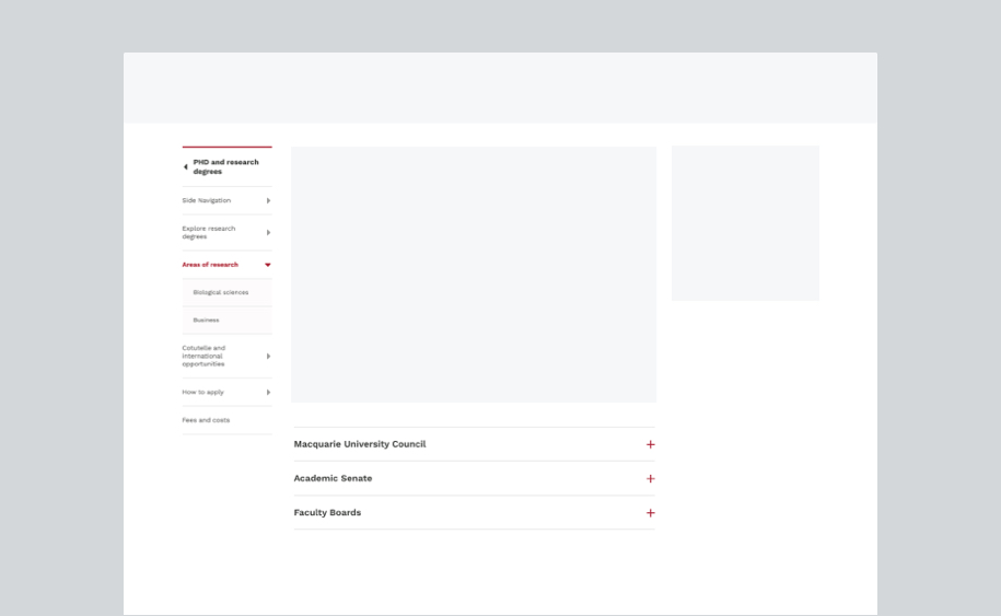
Side navigation
Side navigation should be used in conjunction with breadcrumbs to help users find their way. Content is pre-determined and generated automatically based on the site IA.
Body content
Body content on three column page can contain layouts like text blocks, bullet points, cards, illustrations, images, video player, tables and other types of layouts.
RHS (Right hand stack)
A RHS appears on three column pages and only accomodate tiles that are able to provide relavent information and ficilitate the main content on that page.
One-column pages
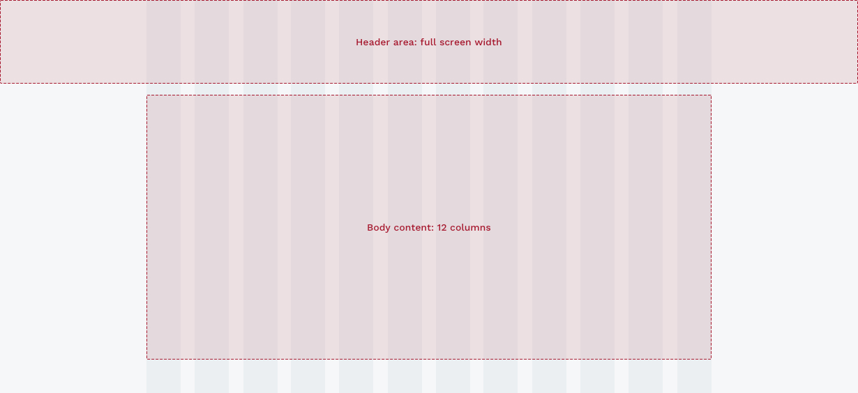
Header area
A header area contains the highest level of navigation and a top banner, appearing at the top of a page and spanning across full screen width.
Body content
A body region presents most of the content on a page. It typically contains layouts such as headings, text blocks, a group of cards, news and events feeds, CTA banners and so forth.
Layout spacing
Use incrementally measured spacing scale to create harmonious arrangements of layouts. This also gives a page a predictable and consistent rhythm vertically and horizontally.
4 px
8 px
16 px
24 px
32 px
48 px
64 px
72 px
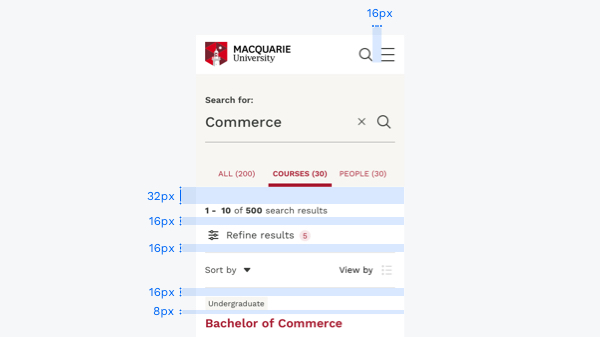
Use smaller measurements for refined spacing needs, especially within layouts, to create a spatial relationship between elements.
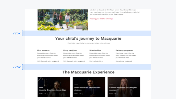
When positioning layouts, please use larger measurements to control the density of the page.
Layout examples
Please see some of the commonly used layouts on one column or three column pages.
Three-column
Side navigation
Side navigation should be used in conjunction with breadcrumbs to help users find their way. Content is pre-determined and generated automatically based on the site IA.
Learn more about side navigationAccordions
Accordions allow users to expand or reduce sections of content. They typically consist of multiple longer blocks of text, with header buttons to open and close each block.
Groups of accordions can be categorised with a subheading to further break-up the content on your page and increase the readability.
Learn more about accordions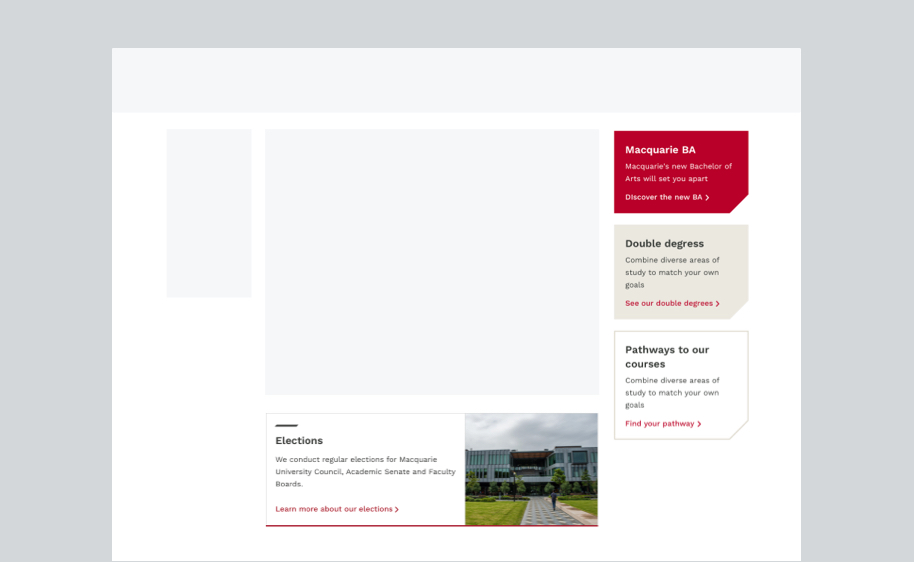
Horizontal cards
Horizontal cards can appear in conjunction with Primary Cards in the content area. They are particularly useful when there is only one, or an odd number of items to display.
Learn more about cardsTiles
CTA tiles appear in the RHS of three-column pages. There are five varieties, which display different information. They appear in a defined hierarchy, providing consistency across pages.
Learn more about tilesOne-column
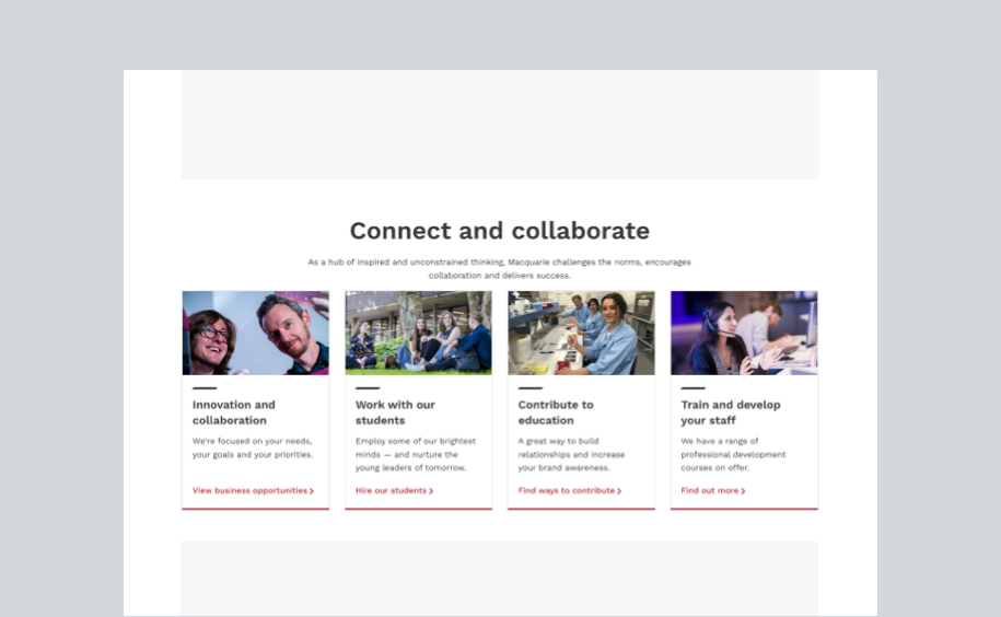
Primary cards
Primary cards will be the first cards displayed on the page. Please have a minimum of 3 or maximum of 4 cards for a layout. A heading followed by a short description can be placed at the top of the card when more context is needed.
Learn more about primary cards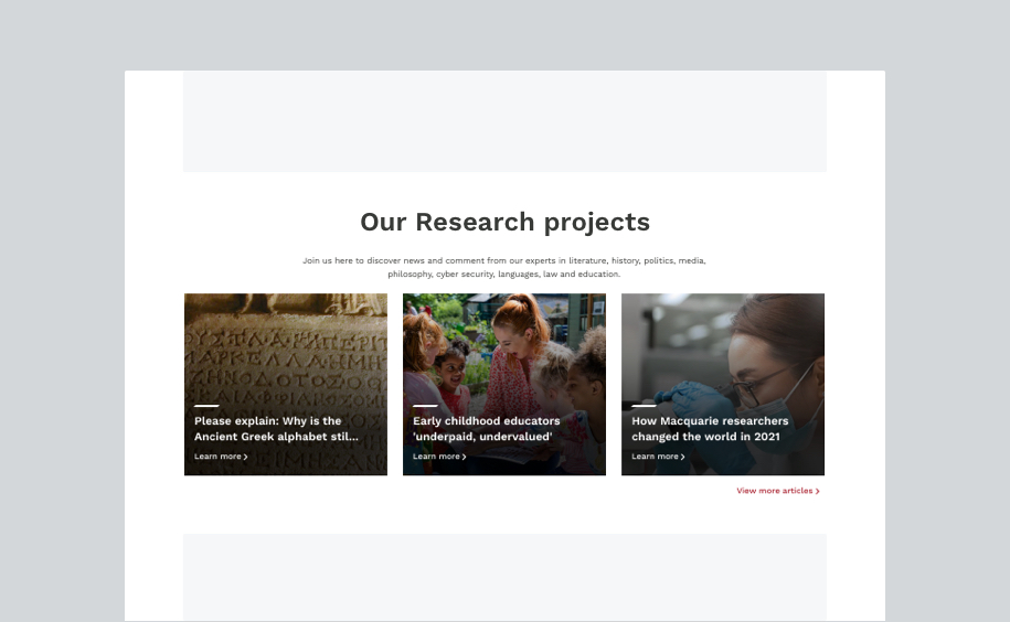
Lighthouse feed
A Lighthouse feed is used on a one-column page. It consists of a minimum of 3 Lighthouse cards with a heading and short description at the top to provide context. A CTA that links to the article list page sits at the bottom of the layout.
Learn more about Lighthouse cards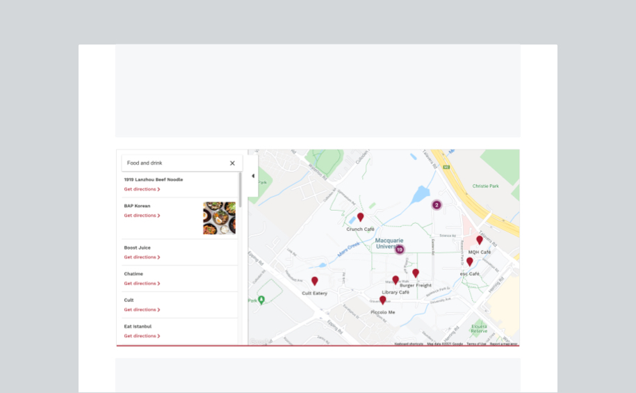
Interactive map
Interactive map is an usefull tool for users to find an area on our campus.
This layout sits across the 12 columns on the grid of a one-colum page.
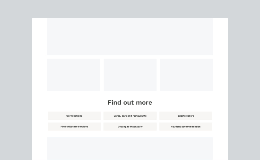
Find out more
Find out more should be used to provide quick links to pages that have related content.
This layout appears at lower part of a one-column page, containing 3 or 6 CTA buttons.
Please keep the button text concise and short. The maximum limit is 30 characters, including spaces.
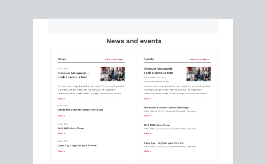
News & events feed
A feed displays content drawn from sources outside the page, including news, events or Twitter. Items are stacked in a list, and link out to where the content is hosted.
On a one-column page, please place 2 components side by side. On three-column pages, components should be stacked up vertically.
Learn more about feeds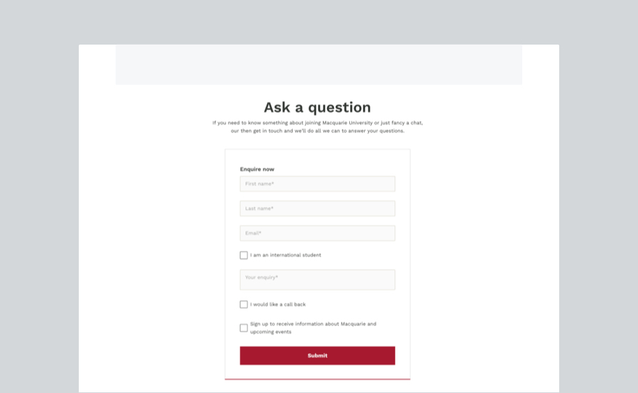
Forms
Forms are highly interactive components that are critical for establishing a relationship with an individual user.
A form can occupy 6 columns on the grid of a one-column page. It should be centred, unless it requires supporting text, in which case the form should be placed on the left.
Learn more about formsWe are always aiming to provide helpful examples of these layouts. Get in touch with any questions or suggestions you have.